An edit page piece in The Times of India by the paper’s edit page editor Swagato Ganguly has got the Russians—or at least their representative in India—all riled up. The piece, “Does soft power matter?“, built on the YouTube video released by Vladimir Putin‘s bugbear Alexei Navalny, has led to a loud protest by Russia’s…
Category Archives: Art
How ‘The Washington Post’ remembers Herblock, its legendary cartoonist, every Christmas
On its anniversary each February, the evening newspaper Star of Mysore prints the same editorial it has published on each of its previous 43 anniversaries. Likewise, on Christmas, The Washington Post prints a cartoon by its legendary cartoonist Herb Block aka Herblock. This cartoon was first printed in 1952.
From launch day to closure, 20 front pages of ‘Mumbai Mirror’
For the first time in 15 years, not counting holidays, Mumbai Mirror is not on the news stands or in homes today, Monday, 21 December 2020, following its “transition” to a weekly newspaper. Below is a collection of front pages of the Bombay tabloid from multiple sources.
‘Biblio’, the books’ magazine launched by three ex-TOI intellectuals, with a colon in its masthead, turns 25
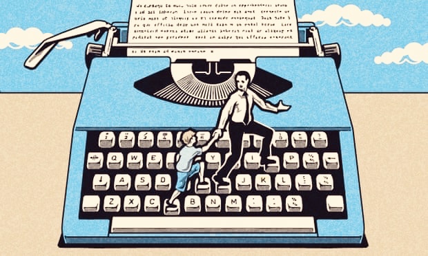
Biblio, the little magazine devoted to books, founded by three former staffers of The Times of India, has turned 25, and the Hindustan Times has a feature on it. Biblio was founded by Dileep Padgaonkar, Arvind Narain Das and Darryl D’Monte in 1995 shortly after they left the paper as it dumbed down to managers…
Looking at most front page headlines on Diego Maradona, you would wonder if the football genius ever used his foot
Football-crazy Bengal has easily beaten football-crazy Kerala and football-crazy Goa in its coverage of the passing of Argentinian legend Diego Maradona. The Bengali daily Anandabazar Patrika (above) has a classy front page, and calm and unckuttered inside pages, in contrast to the early editions of Malayala Manorama and Mathrubhumi (below). *** The Goan newspapers are…
Bhanu Athaiya became India’s first Oscar winner for ‘Gandhi’. But she also did lots of fashion sketches for ‘Eve’s Weekly’.
Bhanu Athaiya, the costume designer who dressed up everybody from Mumtaz to the Mahatma on screen and won an Academy Award for Gandhi, also did plenty of sketches for the now-defunct women’s magazine Eve’s Weekly. Sixty-one of her journalistic artworks, mostly fashion sketches adorning the magazine’s pages, are now being auctioned in three lots by…
‘Marmik’, the magazine that launched a political party turns 60, and the lines are clear in India’s first family of cartoonists: the Thackerays
Marmik, the Marathi illustrated weekly that was the springboard for cartoonist Bal Thackeray‘s political launch, is celebrating its diamond jubilee with a 64-page special issue carrying tributes from a host of contemporary cartoonists. The weekly, christened by Bal Thackeray’s father Prabodhankar, was launched in 1960 shortly after Thackeray Jr had left the Free Press Journal…
Make Art Great Again: the MAGA movement that Indian newspapers sorely need after Donald Trump’s welcome exit
In India’s massive media universe, only The Telegraph is able to capture the significance of the Biden-Harris win in the US elections, that denies oxygen to four more years of unbridled hatred, poison, division, violence and fact-free leadership. “America, unlike India, makes America great again,” says the Telegraph headline. But for the most part Indian…
“Historic. Crossroads. Moment of reckoning”: How magazines freeze-frame #USElection2020 on their covers
Magazine covers in the week of the 2020 Trump v Biden general elections in the United States. ***
Newspaper front pages on acquittal of Babri Masjid accused show how Indian media has been hollowed out of courage and conviction since 1992
When the domes of the Babri Masjid in Ayodhya were brought down in 1992, the year after the liberalisation process began, there was great clarity in the news media and its consumers on the foundations on which the Republic of India stood. Blazing front-page editorials minced no words in denouncing the conspicuous destruction of the…
‘Power of the press belongs to those who own one’: With bigger pictures (and more quotes) of its owner-editor, ‘Rajasthan Patrika’ continues to show the prime minister his place
‘Rajasthan Patrika’, the well-regarded Hindi daily published from 9 states including two in the South, dedicated ‘Patrika Gate’ to the city of Jaipur, its headquarters, on September 8. In itself, the magnificent structure is a stellar addition to the city’s architectural heritage—and a lasting brick-and-mortar contribution by a media house in the digital age. But……
J-POD || Podcast || “Phone is king. Less is best. Follow stories, not editions. Newsrooms must be a zoo of different animals” || Life-lessons from news design guru Mario Garcia
At a time when consumers are exposed to beautifully crafted products from around the world, the first object Indians pick up every morning is The Daily Shame. Barring the odd exception, most Indian newspapers in every language look like a dog’s meal—a mishmash of leftovers of all colours, shapes and sizes with barely any clarity…
TV news channels are a gone case. But why are India’s vast and influential language newspapers burying India’s staggering economic collapse?
On the last day of August 2020, India and China were once again locked in horns at the border. As India’s COVID graph spiralled upwards, India’s economy plunged, contracting 23.9% year-on-year. Jobs, lives, livelihood, families, businesses have been ruined after months of a poorly thought-through lockdown, even as crony capitalism of the Ambani and Adani…
A new design for the ‘Hindustan Times’ from the Mario Garcia factory, which would have apparently “made Mahatma Gandhi proud”
There is a story, probably an apocryphal one, that when Hindustan Times owner Shobhana Bhartia told an American designer who had designed The Washington Post, that she wanted a “good-looking paper”, he is believed to have retorted: “For that you need good-looking ads.” Mario Garcia, the designer who has had a hand in pouring old…
The tribute M.S. Dhoni will treasure the most: four special pages in his hometown’s biggest newspaper
Prabhat Khabar, the Hindi daily first published from Ranchi 36 years ago, pays a handsome tribute to the eastern Indian city’s greatest contemporary contribution to the national and global consciousness, Mahendra Singh Dhoni, upon his retirement from international cricket.
‘Prabhat Khabar’ at 36: how the face of Hindi journalism in the East has changed between 1984 and 2020
Thirty-six years is but a blip in a newspaper’s history, when there are many publications which are over 100 years old. The Times of India was technically launched in 1838, making it just 18 years short of 200. The Hindu is 142. But an anniversary is an anniversary, and the well-regarded Hindi daily Prabhat Khabar…
Desi vs angrezi: how language and English newspapers showcase the start of the Ram Temple construction in Ayodhya
India’s language press has been a key force-multiplier of the Hindutva cause—and ipso facto of the RSS-BJP agenda. This is breezily attributed to the language media being more in tune with the aspirations of “real India”. Today’s front pages on the foundation stone being laid for the Ram Temple in Ayodhya, are less a product…
The subtle signals newspapers send in the manner in which they display Amit Shah’s claim of being COVID positive
Union home minister Amit Shah admitted that he had turned COVID positive through a tweet on Sunday. Across the country, the news is the lead story in most newspapers, if not second lead, but the display in some newspapers is revealing of how sections of the media are increasingly mindful of how they are perceived…

How Hindi newspapers in the “cow belt”, force-multipliers of the BJP in the North, lent wholesale legitimacy to Narendra Modi’s cringe-worthy #9pm9minutes photo-op
Media scholars believe that the rise of newspaper circulation in the “Hindi heartland”, disparagingly known as the cow belt, is concomitant with the rise and growth of the BJP on the back of the Ram Janmabhoomi movement leading to the demolition of the Babri masjid in Ayodhya. Certainly, the reforms of 1991 helped in making…

11 sexy front-pages of the French daily ‘Liberation’ which show journalism needn’t be deathly dull even in the time of a raging pandemic
Front pages of newspapers across the world have the same, sombre look and feel in the time of disease and death. Not the French daily Liberation, which continues to keep the shopfront stylish and inviting. The piece de resistance came on the day after Asterix illustrator Uderzo passed away: Obelix carrying Coronavirus.
